Here to Win
World Wheelchair Rugby
Background
The International Wheelchair Rugby Federation, the official governing body for the sport of wheelchair rugby, approached Cossette to develop a new identity and campaign for the brand ahead of the Tokyo Paralympics. The sport had been seeing a steady decline in attendance and interest, and felt that they needed a new identity which could help bring in a new generation of fans and international attention for the sport.
Ask & Challenge
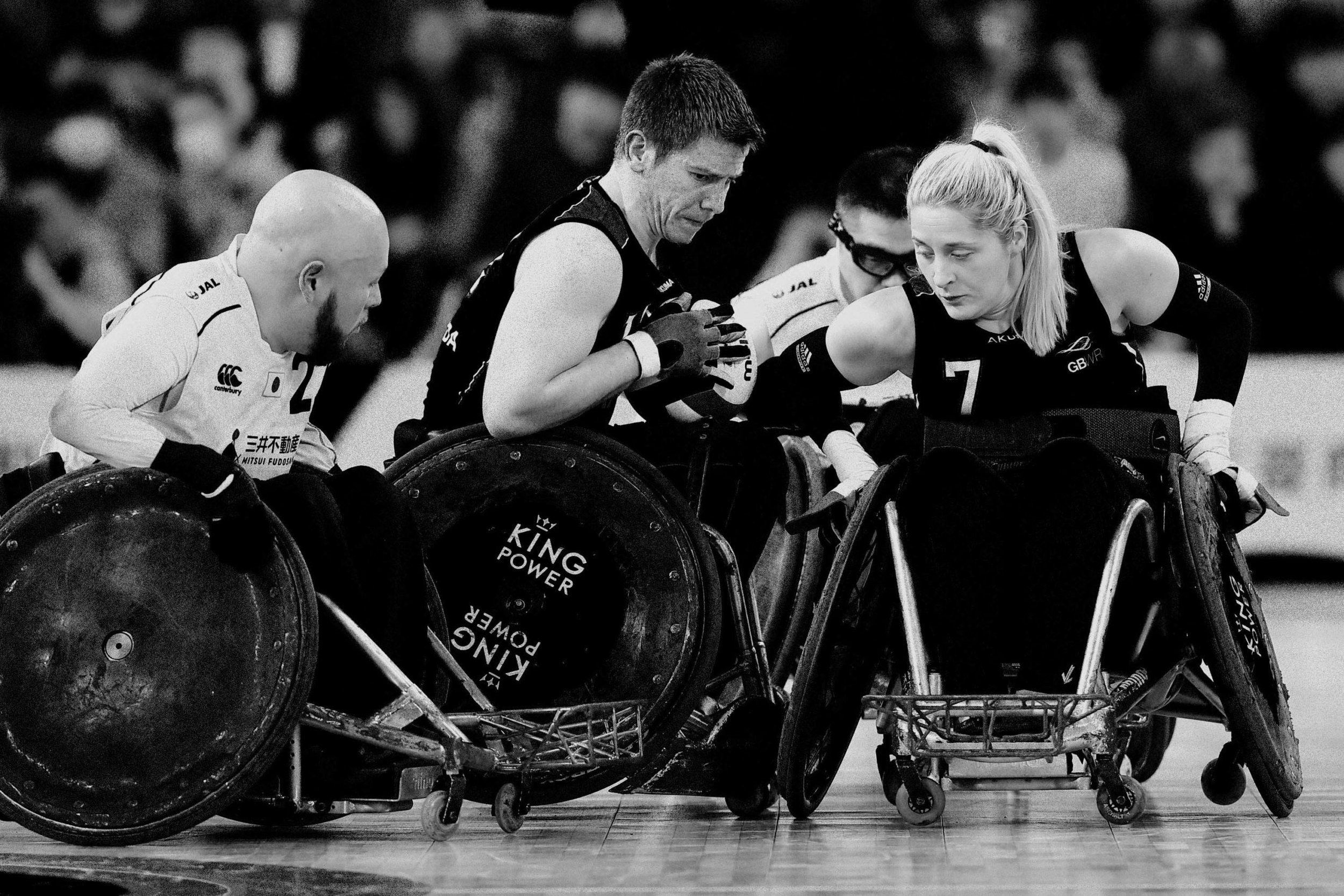
As a governing body, the IWRF reflected order and administration within the sport. The challenge with this is that it creates a brand that is cold, clinical and boring. This is so distant from the reality of the sport, which is fast-paced, aggressive, and fearless: there’s a reason it was originally called ‘Murderball’.
We needed to develop an identity which could reflect the reality of the sport, exciting a new generation of fans, without undermining the IWRF’s role as a governing body.
Insight
The story the IWRF brand was telling about Wheelchair Rugby was dull. It focused more on administration and rules than on the reality of the sport and the people playing it. Watching even five minutes of a game instantly demonstrates the athleticism, skill, and action that is central to the sport and its brand.
We needed to shift the IWRF from framing the story of the sport as an “inspirational sport for people with disabilities” into what it actually was: high performance athletes competing at the highest level of ability.
Approach
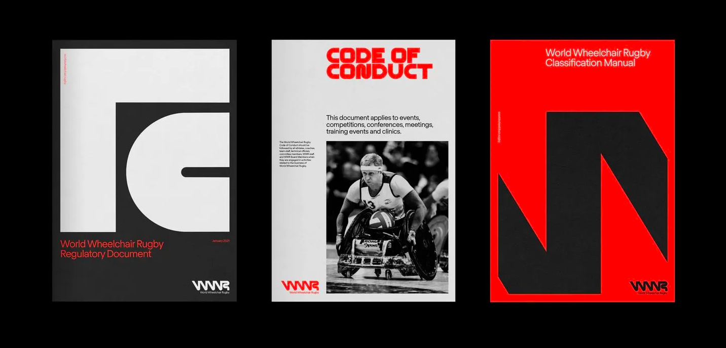
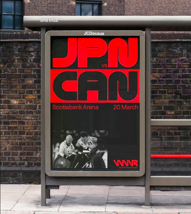
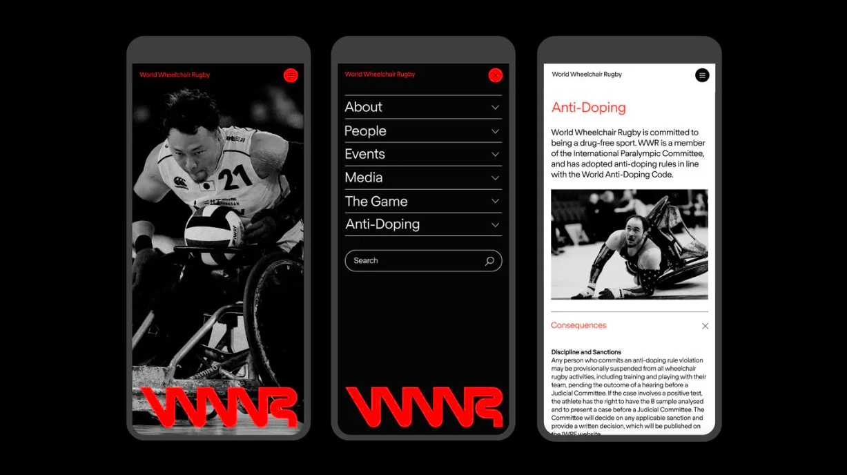
Central to our approach was shifting the positioning of the brand to go up alongside players like FIFA, the NHL and the NFL: from a governing body into a league. From observer to athlete. To move away from the more administrative-sounding initialism of IWRF we changed the name to World Wheelchair Rugby, or WWR, intentionally leaning into comparisons to other three-letter leagues.
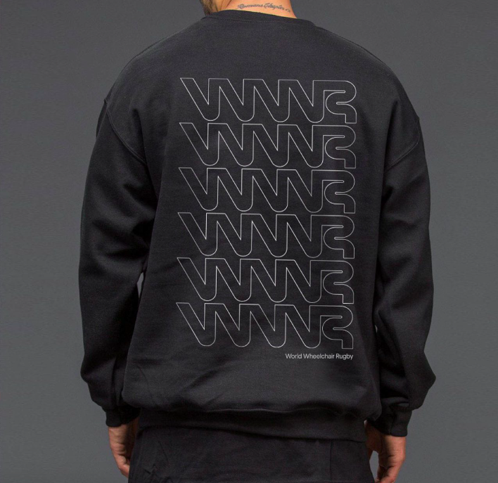
To develop the identity we focused on the action in the sport itself, tracking the movement of players across the court as they invaded and evaded, aggressively turning, spinning, tackling, and checking. This is reflected most in the wordmark, which was designed based off the forward momentum of the players on the court and how they can speed, move, and pivot on a dime.
The bold, graphic identity allows for professionalism, while maintaining and demonstrating the intensity of the sport itself.
Alongside this we developed a campaign, “Here to win”: the players in wheelchair rugby aren’t there to be your inspirational story. They’ve come to play, to fight, to score, to win.
“We’re not here to inspire. We’re here to win.”

Awards
AToMic | Silver
D&AD | Graphite Pencil
Marketing Awards | Gold | Design
Applied Arts Awards | Various
Services
Brand positioning
Brand strategy
Tone of voice and Brand Persona
Campaign development