Shaping The Future of Energy
Galp
Background
From lighting gas lamps on the streets of Lisbon in 1846, to creating the largest network of electric car charging stations today, Galp has been a household name providing energy solutions across the Iberian peninsula for nearly two centuries.
But Galp was at a crossroads within the changing energy landscape and their increasingly diversifying energy portfolio. They needed an identity that could adapt to their constantly changing future.
Ask & Challenge
How much should a 180-year-old brand really change? The iconic Galp orange was recognised across Portugal and Spain, but what did it really represent for the organisation?
This was at the heart of our challenge: determining what the balance would be between equity from the past and ambition from the future. We needed to create a brand that could be championed by multiple stakeholders across several lines of business, across a veritable hydra of products, brands, sub-brands, and internal initiatives.
Our approach needed to be rooted in this precarious balance with the past, while still making room for Galp to continue to grow.
Approach
We began this project with a thorough, 3-month-long audit of Galp’s existing businesses, products, and brands. We conducted over 70 interviews in English, Spanish and Portuguese, with people from all levels of the company —from the CEO to station staff— as well as workers in Spain, Portugal, Angola, Sao Tome e Principe and Brazil. Alongside these interviews, we visited offices in Lisbon and Madrid, the refinery in Sines, and many gas stations across the peninsula.
The goal in this thorough approach to the research was to learn about Galp’s past, see the reality of the business and brand in the present, and understand its roadmap for the future.
Insight
At the heart of the challenge is that for nearly 180 years the absolute majority of what Galp offered was solely gas and oil. Over the last decades, that portfolio has diversified to represent the varied forms of energy that communities and businesses use around the world.
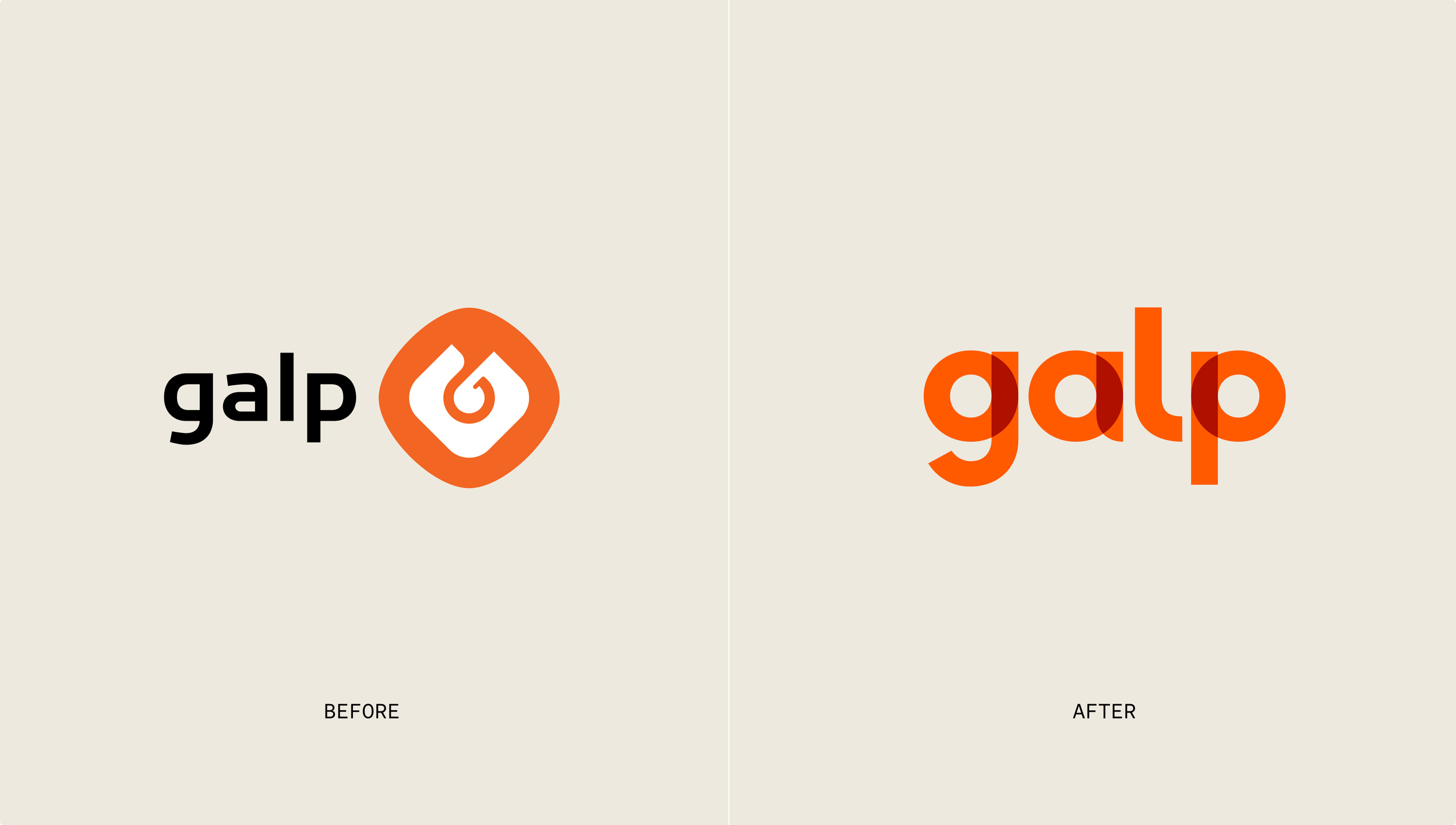
But that transformation was not reflected in the brand at all. This was most obviously noted within their old logo which was designed to look like a drop of oil and a flame. The identity they’d developed didn’t reflect the reality of what they offered to their customers and communities, nor the role that they played in their lives.
We needed to shift their position in the market from a historic hegemony to a better reflection of the truth: a partner working to shape the future of energy alongside communities globally.
New Identity
To avoid challenges of being bound by a single icon that defined an often uncertain future, we removed the classic oil & flame symbol and moved to a wordmark-based identity.
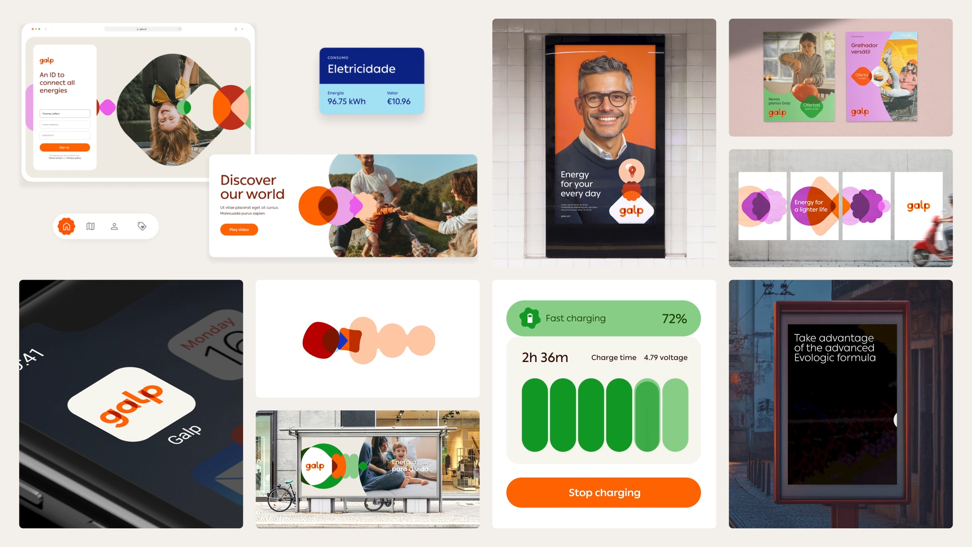
Alongside this we created a visual language which introduced a variety of abstract symbols which represent all the different forms of energy they offer, from gas and oil through to hydrogen and solar. These symbols work and stack together to reflect the unique energy needs of the varied communities they serve.
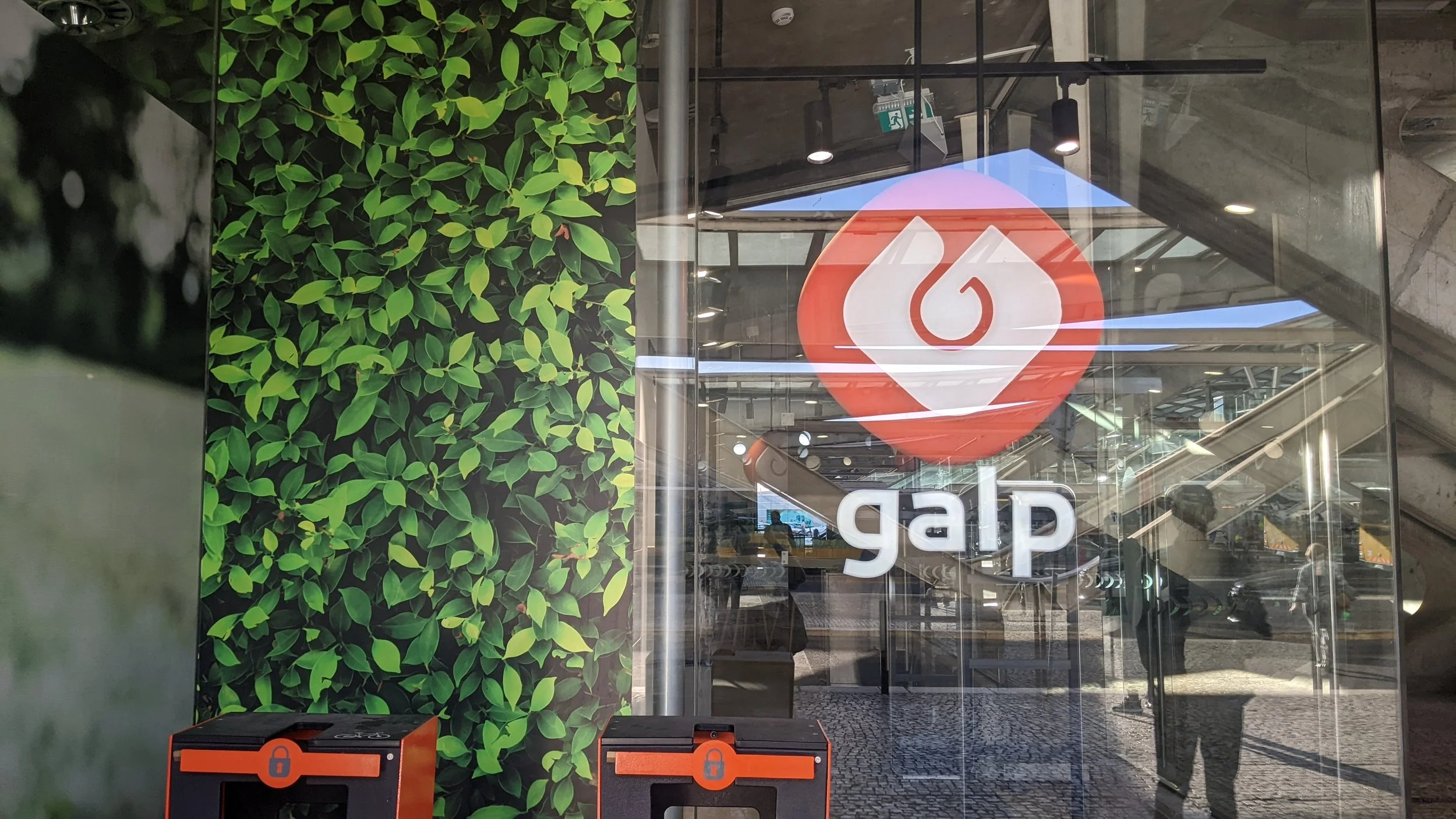
We retained the classic Galp orange, adjusting it slightly to reflect the needs of a modern digital brand, which worked with a new palette and integrated brand system to create a future-ready identity.
Services
Brand positioning
Brand strategy
Brand architecture
Visual identity development
Employee value proposition
Culture activation planning and roadmapping
Experience design
Service design
Brand persona